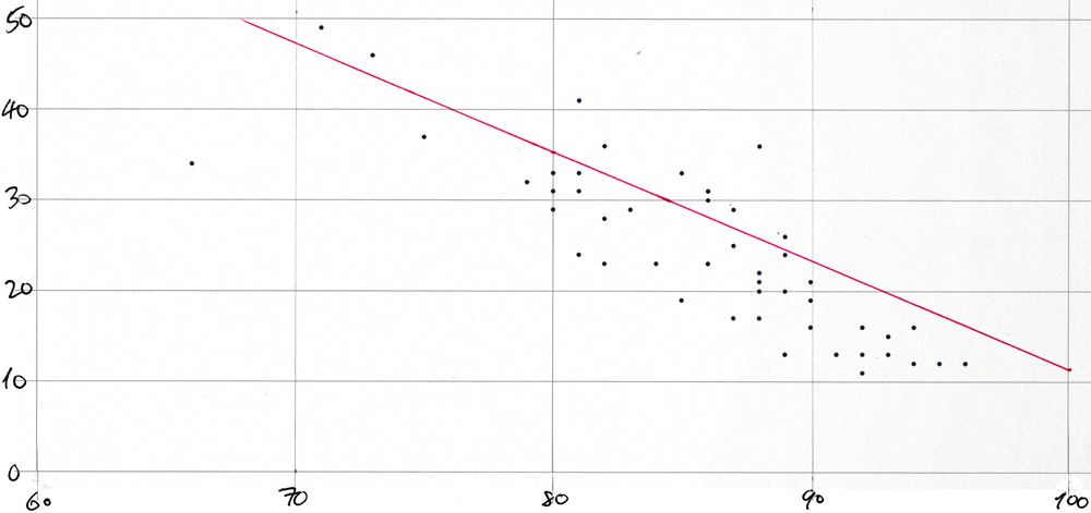
Average COVID-like symptoms vs average mask-wearing by state scatter plot for 21-Oct-2020
Scatter-plot for 21-Oct-2020
The dots on this plot represent "mask_wearing_pct" on the x-axis with "symptoms_pct" on the y-axis from this query:
select
  round(mask_wearing_pct)  as "% wearing mask",
  round(symptoms_pct)      as "% with symptoms",
  state
from covidcast_fb_survey_results_v
where survey_date = to_date('2020-10-21', 'yyyy-mm-dd')
order by 1;
The plot would be too cluttered if each of the 51 points were labeled with its two-letter state abbreviation.
The plot was created simply by pasting a comma-separated list of "mask_wearing_pct"-"symptoms_pct" pairs into a spreadsheet and by using the app's built-in functionality to create a scatter plot from such pairs values. The values were produced with this query:
select
  round(mask_wearing_pct)::text||','||round(symptoms_pct)::text
from covidcast_fb_survey_results_v
where survey_date = to_date('2020-10-21', 'yyyy-mm-dd')
order by 1;
Then the plot was printed and the line was drawn in by hand using the slope and y-axis intercept from this query:
with a as (
  select
    max(survey_date)                               as survey_date,
    regr_slope    (symptoms_pct, mask_wearing_pct) as s,
    regr_intercept(symptoms_pct, mask_wearing_pct) as i
  from covidcast_fb_survey_results_v
  where survey_date = to_date('2020-10-21', 'yyyy-mm-dd'))
select
  to_char(survey_date,      'mm/dd')  as survey_date,
  to_char(s,  '90.9')                 as s,
  to_char(i,  '990.9')                as i
from a;
This is the result:
 survey_date |   s   |   i
-------------+-------+--------
 10/21       |  -1.2 |  131.4
And here is the plot:

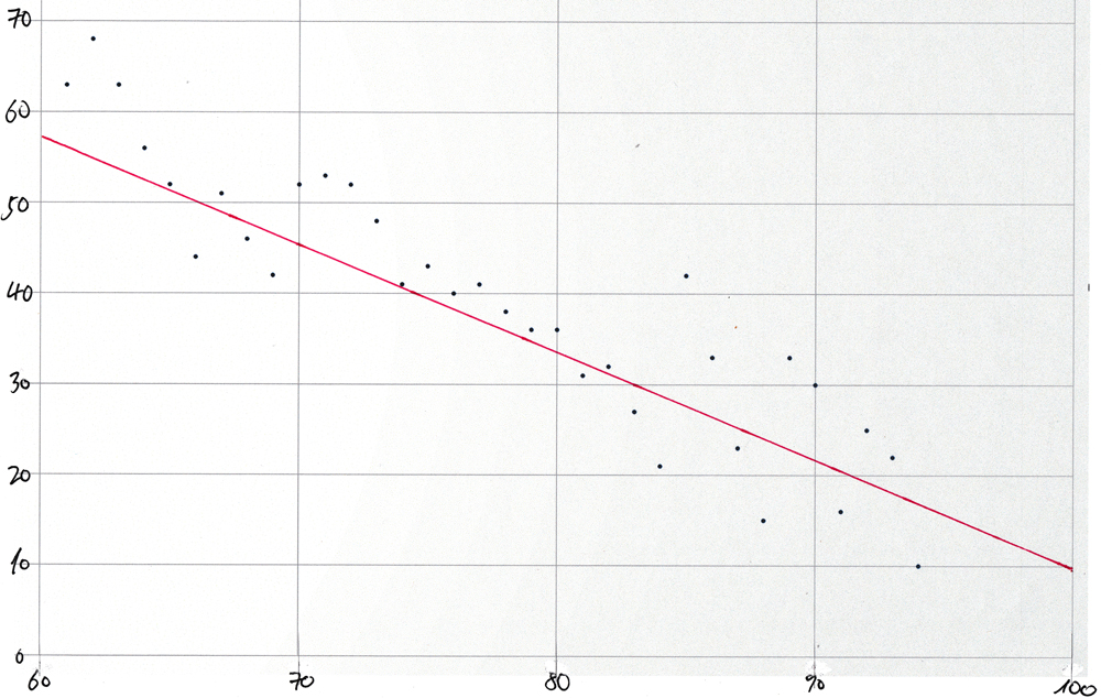
Scatter-plot for synthetic data
For comparison, the same technique was used to create a scatter-plot and to draw in the best-fit straight line using synthetic data by running the procedure "populate_t()" described in the section Create the test table within the section that introduces the built-in aggregate functions for linear regression analysis.
create table t(
  k      int primary key,
  x      double precision,
  y      double precision,
  delta  double precision);

create procedure populate_t(
  no_of_rows  in int,
  slope       in double precision,
  intercept   in double precision,
  mean        in double precision,
  stddev      in double precision)
  language plpgsql
as $body$
  ...
This code, and the remaining code below, needed to make the scatter-plot for synthetic data is included in synthetic-data.sql.
It uses the function normal_rand(), brought by the tablefunc extension to add pseudorandomly generated normally distributed noise the y-axis values produced by the "y = m*x + c" formula for the straight line.
It was then invoked like this:
call populate_t(
  no_of_rows  => 100,
  mean        => 0.0,
  stddev      => 5.0,
  slope       => -1.2,
  intercept   => 131.4);
using the values for slope and intercept from the regression analysis of the COVIDcast data for 21-Oct-2020 and by choosing a value for the "stddev" actual argument arbitrarily.
The comma-separated pairs for the spreadsheet were produced by this query:
select
  round(x)::text||','||round(y + delta)::text
from t
where
  x > 60        and
  x < 95        and
  x is not null and
  y is not null
order by x;
And the values for the slope and y-axis intercept were produced by this query:
with a as (
  select
    regr_r2       ((y + delta), x) as r2,
    regr_slope    ((y + delta), x) as s,
    regr_intercept((y + delta), x) as i
  from t)
select
  to_char(r2,  '0.99')                as r2,
  to_char(s,  '90.9')                 as s,
  to_char(i,  '990.9')                as i
from a;
This is the result:
  r2   |   s   |   i
-------+-------+--------
  0.98 |  -1.2 |  130.8
The emergent values for the slope and intercept are very close to the values (-1.2 and 131.4) that were used for the invocation of "populate_t()".
Here is the resulting plot
 :
:
Note: The normal_rand() function produces a different set of pseudorandomly distributed values each time that synthetic-data.sql is run. But the overall shape of the scatter-plot will remain the same.